Small Apartment, Big Style: Decor Ideas for City Living
Smart layout, double-duty furniture and vertical storage let small city apartments feel open without...

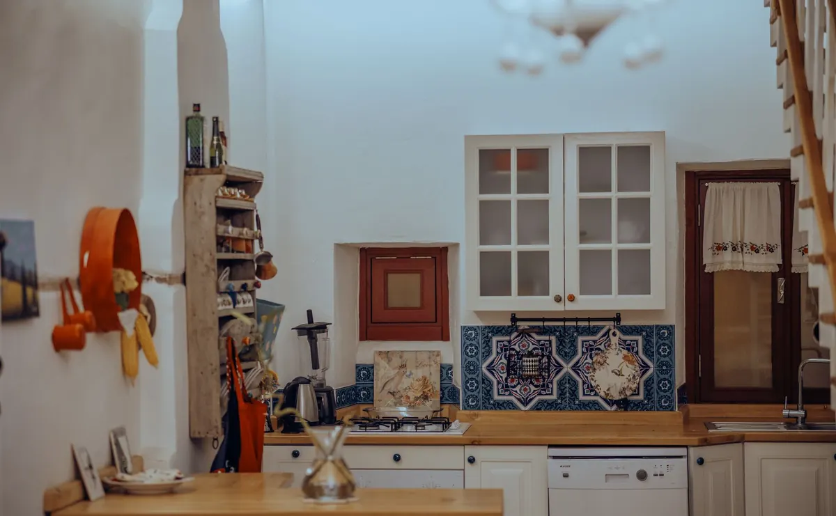
Kitchens age faster than any other room in the house. Cabinets that looked crisp a decade ago now read as heavy, and the countertop that was once the star of the show quietly turns the whole space beige. The encouraging part is that most of what makes a kitchen feel dated isn't the expensive stuff. It's lighting, clutter, finishes, and the small decisions nobody thinks about until they're standing in the room wondering why it feels off.
A single ceiling light in the middle of the room is the most common reason a kitchen looks flat. It throws shadows into the corners, washes out cabinet fronts, and turns chopping onions into guesswork. A kitchen that feels current almost always has light coming from more than one place.
Think in three layers, and add them in this order:
Bulb color matters as much as placement. Cool, blue-white bulbs make wood look gray and stainless look clinical. Warm white in the 2700K to 3000K range flatters cabinetry and skin tones alike. If your lighting is harsh and there's no dimmer, that's a small job with an outsized payoff. Adding new circuits or recessed cans is not a do-it-yourself project — bring in a licensed electrician for anything behind the walls.
Cluttered counters are the fastest way to make a renovated kitchen look tired. Every appliance, jar, and stack of mail sitting out competes for attention, and the eye reads the mess instead of the room. Empty counter space looks intentional. Full counter space looks like a Tuesday.
Try this reset, which takes about an hour:
One exception worth making: leave out the one thing you love looking at. A good ceramic bowl or a nice wood board earns its space. The air fryer usually doesn't.
Matching cabinet fronts, matching wood floors, matching trim, matching stools — the all-one-tone approach was standard advice for years, and it's a big part of why some kitchens feel stuck in 2009. Rooms feel current when there's contrast and a little variation.
You don't need to repaint anything. Mix two wood tones instead of one, trade the matching canister set for a mix of glass, ceramic, and wood, or add a single painted piece — a stool, a small cart — in a color pulled from the backsplash. Small mismatches read as collected rather than catalog-ordered.
A thin strip of mosaic tile running behind the stove, floating in a sea of builder-beige drywall, dates a kitchen instantly. So does the vast empty wall above the cabinets, which makes ceilings feel lower than they are.
Paint is the cheapest correction here. Choose a wall color that either contrasts your cabinets deliberately or sits a shade deeper than the cabinets do, and carry it up to the ceiling line if the room can take it. If you've been eyeing the empty space above your uppers, fill it with one long, simple object — a row of matching baskets, a single plank of wood — rather than a collection of small tchotchkes. And if you're considering removing a soffit, check with a contractor first; they sometimes hide ductwork or wiring.
Cabinet pulls and a faucet are the jewelry of a kitchen, and they're where dated details hide. Ornate scrollwork, tiny round knobs spaced awkwardly, and short faucets with a separate sprayer all pull a room backward.
What to look for instead: simple bar pulls or cup pulls in a finish you'll still like in five years, sized so there's a comfortable hand's width on each side, and a faucet with a high arc and a pull-down sprayer. Stick to two metal finishes at most — say, brushed brass hardware with a stainless appliance package — and repeat each one at least twice so it looks deliberate. Take a cabinet door or a clear photo with measurements when you shop, and hold the new hardware against the wood in daylight before you commit.
Tile floors, stone counters, stainless steel, painted drywall. Kitchens are built from unforgiving materials, and without a few soft elements they feel like a laboratory. Texture is what makes a space feel lived in and warm rather than merely clean.
Add a washable runner with a non-slip pad in front of the sink. Lean a thick wood board against the backsplash. Hang a linen towel instead of a printed one. Put a real plant near the window — herbs you'll actually use count double. None of this costs much, and together it changes how the room feels more than a new backsplash would.
Open shelving styled with three identical white pitchers and nothing else is a photograph, not a kitchen. Shelves should hold what you reach for: everyday plates stacked, mugs within reach, a bowl for fruit. The styling comes from how it's arranged, not from emptying it out.
The same goes for decor that gets in the way. A giant vase on the island, a decorative tray where you need landing space, a sign that says something about coffee — if it costs you counter room, it's working against you.
Start with light. Swap cool bulbs for warm ones, put the overheads on a dimmer, and add a stick-on LED strip under the cabinets if you can't hardwire anything. Then clear one counter completely and put back only what you used this week. Then change the cabinet hardware, which is often the single most visible upgrade for the least money.
Those three moves take a weekend and cost far less than new cabinets. Do them and you'll notice the room feels lighter, calmer, and considerably more current — which is really what people mean when they say a kitchen looks updated.
Photo: UMUT 🆁🅰🆆 / Pexels
Smart layout, double-duty furniture and vertical storage let small city apartments feel open without...
Ten countertop items worth keeping out, plus placement rules, zone planning, and a five-minute reset that...
Ambient lighting keeps a room usable; task lighting makes it work. Here's how each layer functions, where...