7 Common Kitchen Decor Mistakes That Make Your Space Look Dated
Small, fixable choices — flat lighting, crowded counters, matched finishes — date a kitchen far more than...

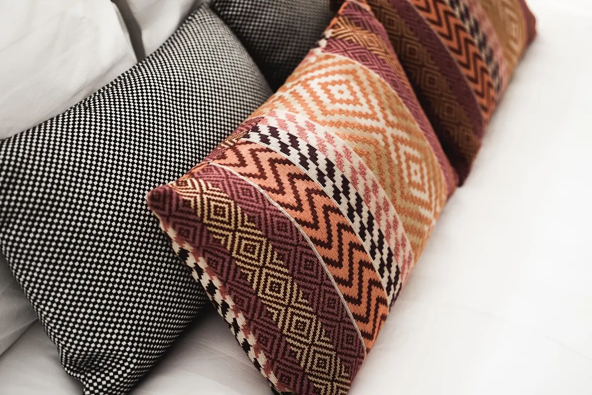
Pattern mixing has a reputation problem. People flip past a layered, collected room in a magazine and assume the owner was born with an eye for it. In practice, that room was almost certainly built on a few repeatable decisions: a limited color palette, a clear difference in pattern scale, and one or two plain pieces doing the quiet work of holding everything down.
None of that requires a design degree. It requires looking at your sofa, your rug, and your throw pillows as one composition rather than three separate purchases. Get that habit started, and stripes, florals, and geometrics stop fighting each other.
This is the step beginners skip, and it is usually the reason mixing goes sideways. Patterns are made of color. If your patterns do not share colors, no amount of careful arranging will save them.
Pick three: one anchor (navy, charcoal, forest green, black), one base (white, cream, oatmeal, natural linen), and one accent (rust, mustard, blush, teal). Then shopping gets simple — any pattern is welcome as long as it reads as those three colors. A navy-and-white stripe, a cream floral with rust leaves, and a charcoal geometric can all live in the same room because they are speaking the same language.
Three is not a magic number, but it is a small one. Four or five colors is where rooms start to feel like a fabric shop after an earthquake.
Color gets you in the door. Scale keeps you out of chaos.
A room works when the pattern sizes are clearly different from one another. Three medium patterns — a medium check, a medium floral, a medium stripe — read as noise, because your eye cannot tell which one to look at first. A large, a medium, and a small read as a hierarchy, and hierarchies feel calm.
Squint at the arrangement. Really do it. If it turns into gray mush, your patterns are too similar in visual weight. If you can still tell there is one bold thing and two supporting things, you are fine.
Take a photo and view it in black and white. Value is how light or dark something is, and it matters as much as hue. If every pattern is medium-dark, they merge into one texture. Aim for contrast: one dark, one light, one mid-tone.
A big blowsy floral on a tiny lumbar pillow looks chopped off. A tiny ditsy print on a large sectional looks like a smudge from across the room. Big patterns need big real estate — a rug, a duvet, a curtain panel. Small patterns are happiest on small accessories.
Stripes, florals, and geometrics are not interchangeable. Each one does a job.
Pattern mixing is not about finding patterns that match. It is about finding patterns that disagree politely.
If you would rather follow steps than instinct, start with one vignette: a sofa, a bed, or a reading corner.
Pillows are the classic training ground because they are affordable and you can swap them in ten minutes. But they are not the only place pattern earns its keep. Try a patterned lampshade against a plain wall, a striped table runner over a solid cloth, a geometric tea towel draped on an oven handle, or a floral bench cushion in an entryway.
Two habits make a real difference. Include at least one solid pillow in every sofa arrangement, so the eye has somewhere to land. And keep patterned pillows in related sizes; a cluster of odd-shaped prints in mismatched scales starts to look like a jumble sale, not a collection.
Pattern mixing fails more often in our heads than in our rooms. Take a photo in daylight, walk away, and come back to it later. A photo flattens the scene and shows you the composition honestly; the room in front of you is too familiar to see clearly at first glance.
If it still feels off after a day, change one thing, not five. Swap a single pillow, roll up the rug and look again, or move the loudest pattern to a spot where it has more space around it. Small adjustments reveal more than a full redo.
Start with three colors, three clearly different scales, and one plain thing holding it all down. That is not a trick or a shortcut. It is simply how good rooms are built, one unhurried decision at a time.
Photo: Abbeylein / Pixabay
Small, fixable choices — flat lighting, crowded counters, matched finishes — date a kitchen far more than...
Smart layout, double-duty furniture and vertical storage let small city apartments feel open without...
Ten countertop items worth keeping out, plus placement rules, zone planning, and a five-minute reset that...